Total Revamp: Phase 1, Part 2 – Headshots
A New (and much better) Headshot Landing Page
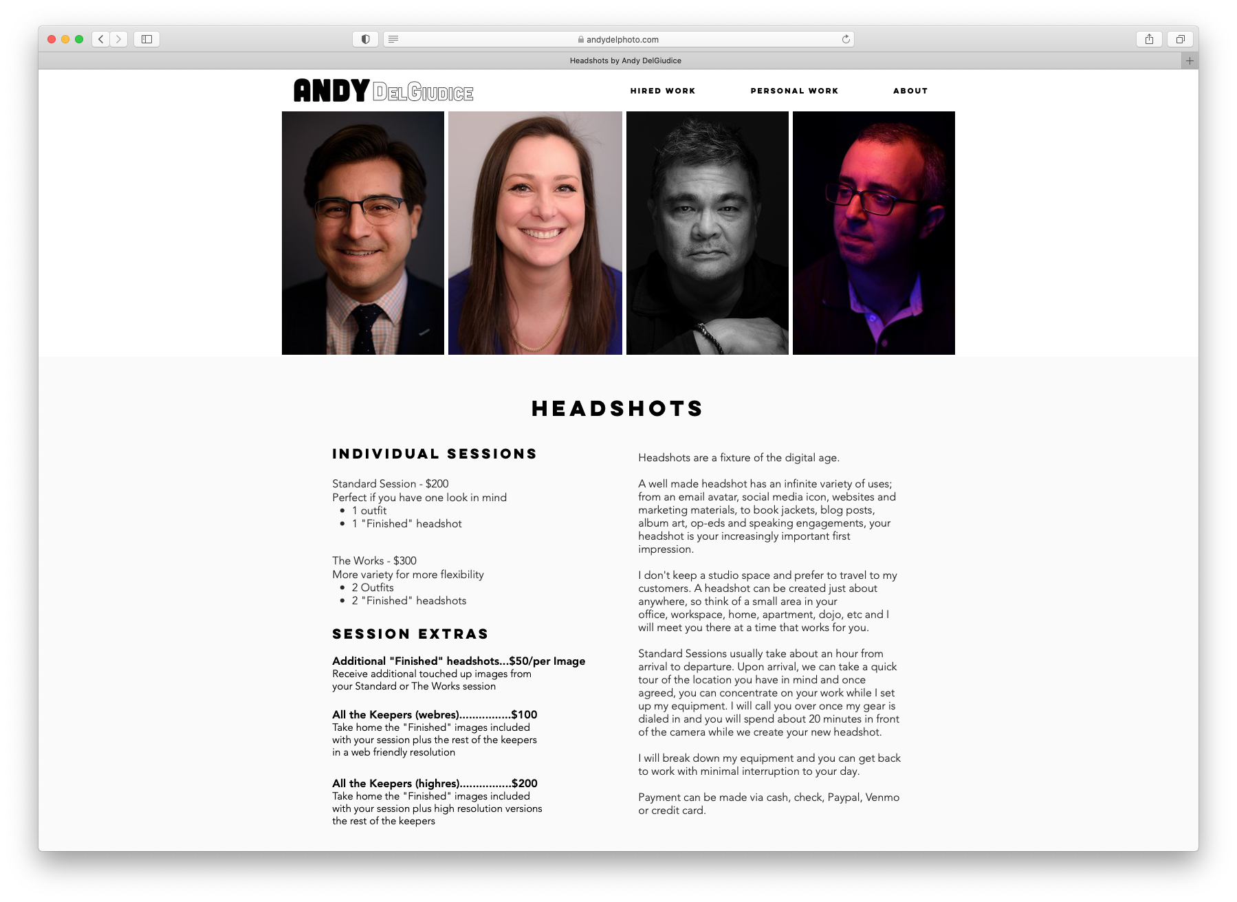
Headshots get their own blog post within my discussion of Phase 1 of my website revamp. As I mentioned previously, I am attempting to move my business from a B2B Corporate Event photographer that booked the occasional headshot or portrait session to a B2B and B2C Headshot and Portrait photographer that books the occasional corporate event. This means a revamped website that better informs new potential customers and Google of who I am and the services I provide.
Well sorted Home, About and Headshot pages are absolutely crucial to this transition. The most important of which, at least for now, is the Headshot page.
Prospective clients (or customers? subjects? sitters?) need to become aware of me, learn about my headshot sessions, decide if my fees meet their budget and discern whether I am competent enough to be trusted with their new headshot.
I think the new headshot page does all of those things; with an emphasis on becoming aware of me in the first place.
The previous version primarily focused on demonstrating competency by showing a lot of very nice headshots that I am very proud to show off, but that overall design was of limited use. Besides the url, there was nothing on the page to inform Google that this was a webpage devoted to headshot services, so it was rare for someone to stumble upon it from a search. All the SEO in the world wouldn’t have helped.
Now, if prospective headshot clients find themselves on my site from the total mess that is a google search result, they will learn about my competency and when and where and how I can create their new headshot. Plus how much the session will cost and any extras they want to go home with.
Publishing prices can be a roll of the dice, but I figure the more info the better. I always appreciate transparency when I’m researching potential service providers, so why not give my prospective clients the same courtesy?

This was all kind of there before, but it wasn’t very clear and no one was landing there in the first place.
Check out the full version by visiting the headshot page of my website.
This post is part of an on-going series about revamping my business.
You can start here: How Did We Get Here?
Or read the previous installment: New Home & About Me pages, plus Footer
Next up in the series is: Phase 2 – New Portrait Landing Page
