Total Revamp: Phase 1, Part 1 – New Home & About Pages, and Footer
A thoughtful redesign of the core landing pages of my website.
What a relief to have new and improved versions of the Home page, About Me page and Footer of my website up and published.
More informative and fleshed out versions of these pages are absolutely crucial to my efforts to transform from a Corporate Event photographer that booked the occasional portrait or headshot session to a Portrait and Headshot photographer that books the occasional corporate event.
This version of my website contains a lot more copy than previous iterations, which should all now properly inform Google of what I’m up to and convince Google to place my website higher up in search results.
The About Me photo I ran for years was getting pretty dated. So much has changed since then. But now that I think of it, the one I replaced it with is pretty old too. But the replacement is a core aspect of my brand so I’m ok with it. (If only I knew someone who could take a headshot for me…)
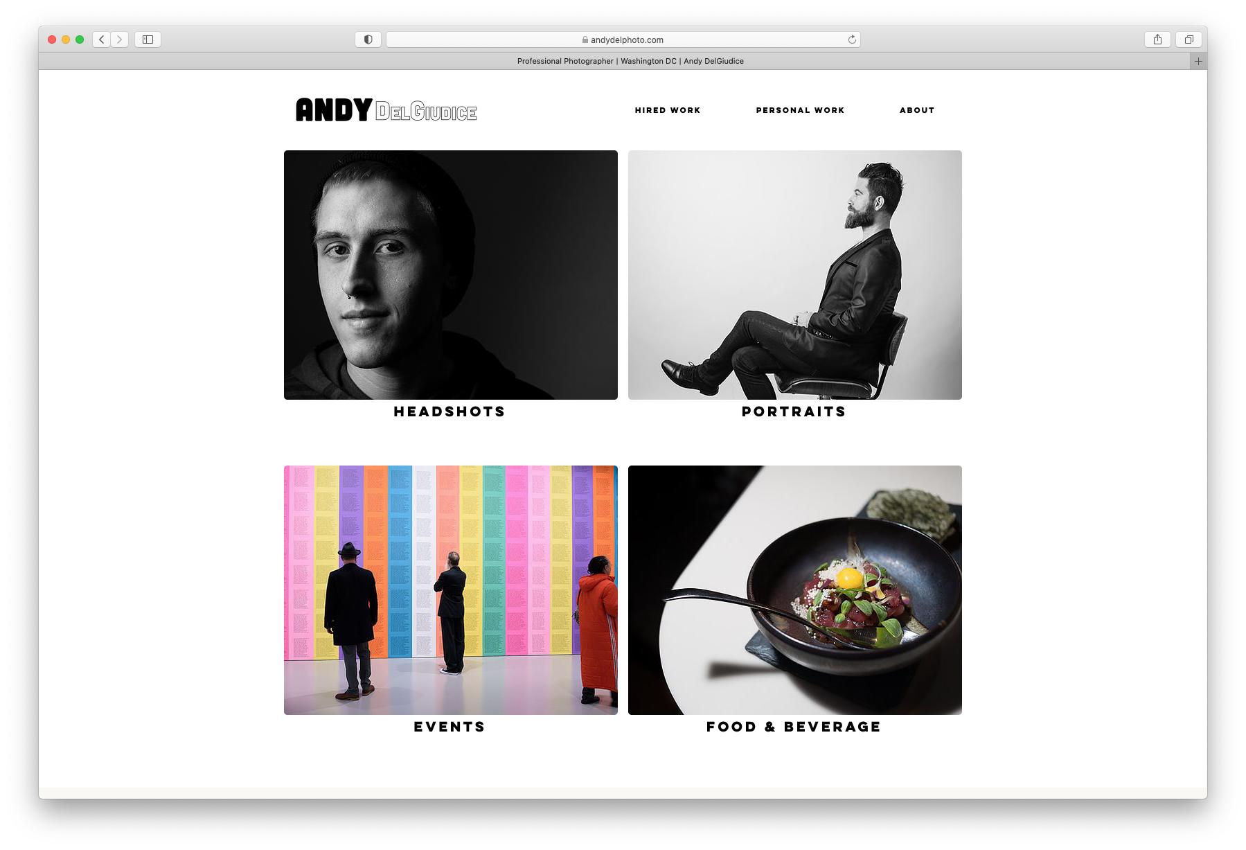
The home page used to be a big, single banner photo and navigation menu that all looked very sleek and cool but didn’t communicate much to the almighty Google algorithm. Very tragic. The new homepage clearly informs viewers (and Google) of the services I provide. This should improve the chances of Google pointing people to my site and make it easier for prospective clients to learn about me and the services I provide and hopefully book a session once they get here.

A screenshot of my new homepage. The images have alt text to tell google what they are. The section descriptions also inform the almighty search giant of my core services.
Shoe horning the initial vision I had in mind for the homepage into the tools made available by Wix was a frustrating process. It took at least a year out of my life. But I have been using Wix since I started professional photography as a full time income all those years ago (2014!) and I can usually figure out how to make it do what I need it to do.
Ironically, I don’t actually remember what I originally had in mind for the homepage but I’m very happy with how it turned out. Necessity is the mother of invention.
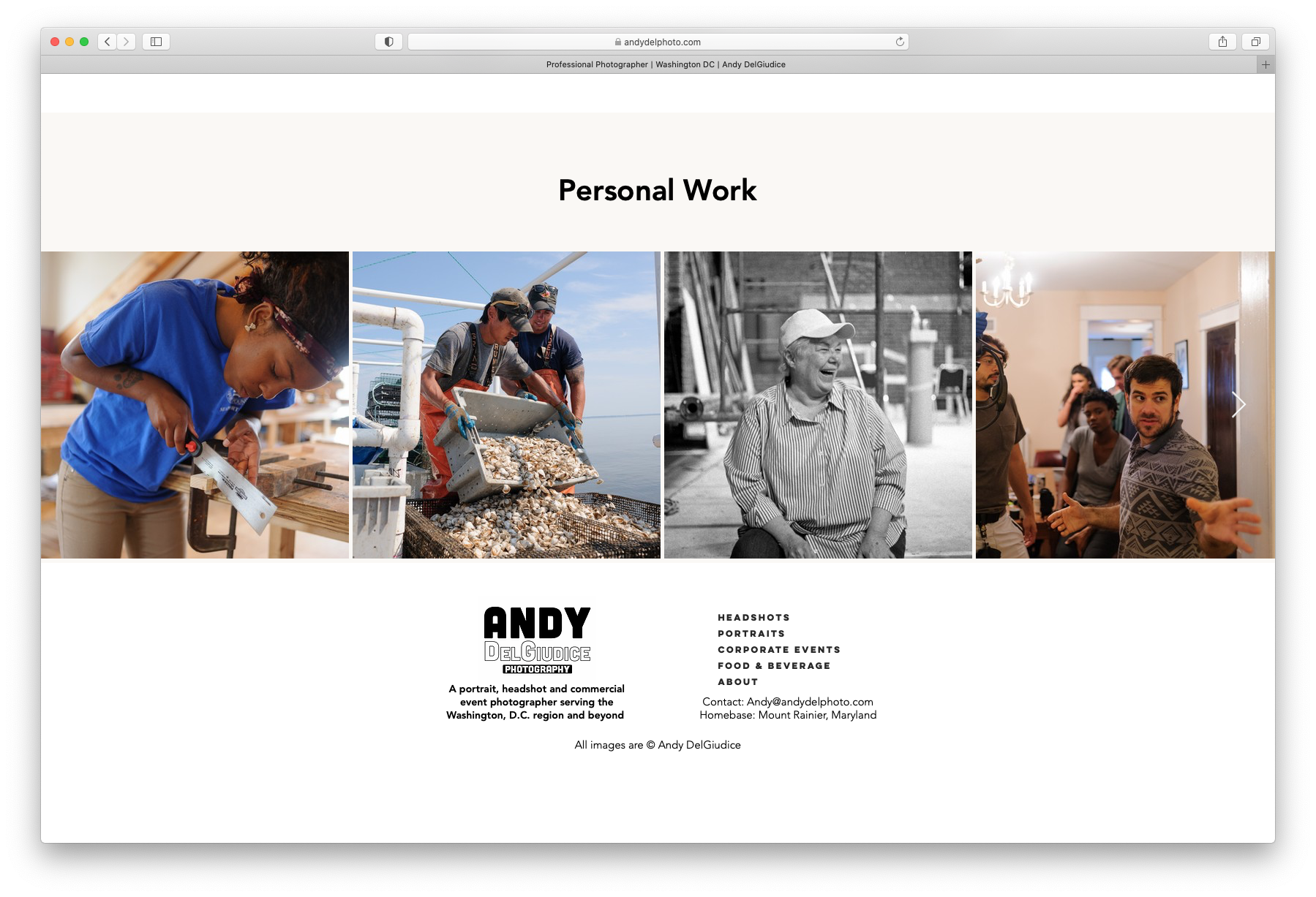
And the footer. Ah the footer. The last resort for finding what you need on a website. Mine now at least communicates the core services I offer (headshots, portraits and corporate events) and where I primarily offer them (the Washington, D.C. area), how to contact me and has links to the most important pages of my website.
It’s nice to implement the fundamentals, for once.

This new, more informative footer has links, contact info, my general home base of operations and an explanation of and links to my core services.
This revamp might actually work.
This post is part of an on-going series about revamping my business.
You can start here: How Did We Get Here?
Or read the previous installment: Total Revamp, Phase 1
Next up in the series is: Total Revamp: Phase 1, Part 2 – Headshots
